
Pop! There it is!
For many years (OK, I’ll be honest, for decades), I worked with the FileMaker platform, a competitor of sorts to the Salesforce platform. Both offer tools to quickly build database-driven apps for various target platforms, including the web. FileMaker has a particularly useful widget called the popover. The basic idea is that you can place a button on the screen and when the user clicks the button, they get a small window attached to the button with additional information.
While Salesforce doesn’t (yet) have an analogous Lightning Web Component, this feature is offered by the Lightning Platform. In this article we’ll walk through building a Lightning Web Component that takes advantage of the Lightning Design System and, one of my favorite LWC features, slots, to create a reusable popup window.
Note that the component presented here is bare-bones. There is plenty that could be added to this initial version. Consider this a starting point from which you can customize to your needs.
Component Spec
Here are the features this component will support:
- The ability to customize the button’s icon, alternative text, title, and variant
- The ability to show whatever content we want within the popup window
- The ability to dismiss the window by either hitting the escape key or clicking anywhere outside the window
Styling
The popoverButton.css file is the simplest, so let’s cover that first.
lightning-icon {
    cursor: pointer;
}

section {
    position: fixed;
}
.outside-click-capture {
position: fixed;
z-index: 5999;
top: 0;
left: 0;
right: 0;
bottom: 0;
}
The first CSS rule is pretty self-explanitory. Within the HTML, we’re using the lightning-icon component, but this icon will be acting like a button, and buttons should show a pointer when they’re hovered over. This rule takes care of that.
Next we have our section rule. Here we set the position to fixed so that the component doesn’t jump around when we open and close the popover window.
As you’ll see, the outside-click-capture class selector is applied to a div tag in the HTML, which will allow us to dismiss the popup window when the user clicks on the page’s background. We use a z-index to place it above everything else on the page, and position it fixed to the top left of the page so that it covers everything else.
Markup
Now let’s take a look at the HTML:
<template>
    <lightning-icon
        icon-name="{iconName}"
        alternative-text="{altText}"
        onclick="{handleButtonClick}"
        class="slds-var-m-left_medium"
        size="small"
        title="{title}"
        variant="{variant}"
    ></lightning-icon>
    <div
        if:true="{showPopover}"
        class="outside-click-capture"
        onclick="{handleOutsideClick}"
    ></div>
    <section
        if:true="{showPopover}"
        class="
            slds-popover
            slds-nubbin_left-top
            slds-var-m-left_small
            slds-popover_small
        "
        role="dialog"
    >
        <div class="slds-popover__body">
            <slot name="body"></slot>
        </div>
    </section>
</template>
We have just a few tags in our top-level template tag. First we have our clickable icon, reading various attributes from our JavaScript class. Then our div class for capturing background clicks. The meat of the component is the section tag, which uses various SLDS classes to provide the popover behavior. Within the section we provide a slot for the caller to place whatever components they like inside.
Code
Let’s see how little JavaScript we need to make all of this work:
import { LightningElement, api } from 'lwc';/**
* A generic popover button utility component that displays the specified icon name with the
* given attributes.
* @param iconName: Passed onto the button's `iconName` attribute
* @param altText: Passed onto the button's `alternativeText` attribute
* @param title: Passed onto the button's `title` attribute
* @param variant: Passed onto the button's `variant` attribute
* @slot body The HTML to place in the popup window's body
*/export default class PopoverButton extends LightningElement {
@api iconName = 'utility:info';
@api altText = '';
@api title = '';
@api variant = 'success';
showPopover = false;
/**
     * Toggle the popover when the button is clicked and add or remove an event listener for
     * hiding the popover when the user presses the escape key
     */
handleButtonClick() {
this.showPopover = !this.showPopover;
const keyDownListener = (event) => {
if (
(this.showPopover && ['Escape', 'Esc'].includes(event.key)) ||
!this.showPopover
) {
window.removeEventListener('keydown', keyDownListener, false);
this.showPopover = false;
}
};
if (this.showPopover) {
window.addEventListener('keydown', keyDownListener, false);
} else {
window.removeEventListener('keydown', keyDownListener, false);
}
}
/**
     * Hide the popover when the user clicks outside of it.
     */
handleOutsideClick() {
this.showPopover = false;
}
}
Hopefully all of this is straightforward. When the user clicks the button, we want to show the popover and add an event handler so it can be dismissed when the user clicks outside the popup window. That event handing is the only real complication in the logic.
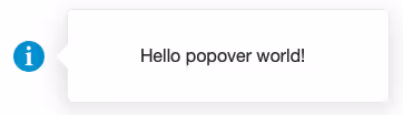
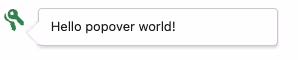
Now we can use our new component to place a popup window wherever we like.
<template>
    <c-popover-button
        icon-name="utility:key"
        alt-text="My popover alternative text"
        title="My popover title"
    >
        <span slot="body"><p>Hello popover world!</p></span>
    </c-popover-button>
</template>
Here you can see that we’re overriding the icon name, alternative text, and title, but accepting the default variant.
Customize
You’ll find all of the code for this component in our GitHub repository. We’d love to see what improvements you might make that could be rolled into this new open source tool.
The Lightning Design System offers many additional features that we could reveal via the API, such as headers and footers. Be sure to take a look at the documentation to become familiar with all of the options. In fact, I consider this a first version of this component, and look forward to expanding the functionality with additional features until, ideally, all of the LDS features are supported via the API.
What features would you find most useful? Drop us a line and let us know.

Protect Your Org.
Secure Your Data.
Salesforce security is a shared responsibility. Don't try to solve it alone.
Salesforce Updates and Guidance
Explore expert strategies and practical advice on Salesforce security and permissions


